
You walk into your living room. You bought the beautiful sofa and chose the perfect paint color. Yet, the space feels entirely wrong. Identifying common interior design mistakes takes a trained eye.
Without knowing the rules, you sit there feeling frustrated. Your expensive furniture just looks like a chaotic and disconnected mess.
You will discover the invisible rules of scale, lighting, and placement that professionals use to finish a space. This guide provides the exact 20 minute fixes needed to completely transform your room right now.
The 20-Minute Design Audit
Your room feels wrong but you don’t know why. Fix the invisible rules below to achieve visual harmony.
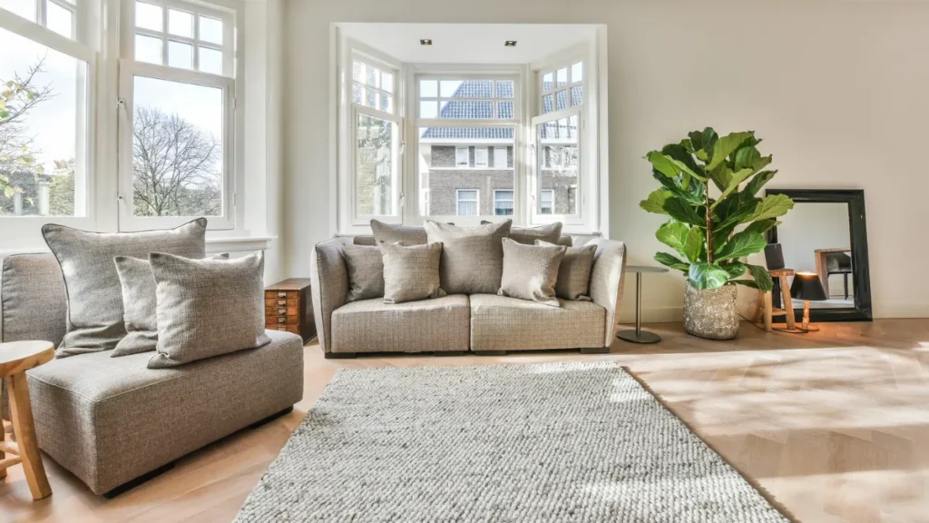
The Rug Is Floating In The Middle Of The Floor
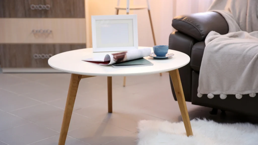
You look down at your floor and see a problem. A tiny rectangle of fabric sits helplessly under your coffee table. The front legs of your sofa rest entirely on bare wood. Professionals call this the magic carpet effect.
This specific mistake ruins your room proportions. Small rugs visually chop up the floor space. They force your eyes to focus on a tiny central island. This makes the entire room feel incredibly cramped and disconnected.
The Golden Placement Rule
You must anchor your furniture together physically. The absolute golden rule of rug sizing requires connection. The front legs of all major furniture pieces must sit firmly on the rug.
This simple rule instantly unifies the space. When you follow this living room decorating rules standard, the room expands visually. The large rug creates a dedicated zone for conversation. It tells the eye exactly where the seating area begins and ends.
Avoiding The Sizing Trap
People constantly buy the wrong size. According to an Apartment Therapy survey, 80 percent of rugs purchased for living rooms are too small for the space. People see a low price tag and compromise on dimensions.
You can fix room layout issues immediately by buying the correct size. Measure your seating area completely before you ever start shopping. You need to know the exact dimensions of the outer furniture edges.
Budget Friendly Layering
Large rugs cost serious money. Buying a massive vintage Persian rug might stretch your budget too far. You can completely bypass this expense using the designer layering method.
Buy a large and inexpensive jute rug to serve as the base layer. Then place your smaller accent rug directly on top of it. This gives you the necessary square footage without the massive price tag.
Accessible Upgrades
A standard three seat sofa requires an 8×10 rug at minimum. If you have a large sprawling sectional, you need a 9×12 rug. You do not have to spend thousands of dollars to achieve this scale.
Brands like Ruggable sell excellent 8×10 washable rugs for around $399 right now. This makes proper room scale highly accessible for normal budgets. Once you fix the floor, you need to look up at your ceiling.
| Room Size | Recommended Rug Size | Furniture Placement Rule |
| Small (10×12) | 6×9 | Front legs on the rug |
| Medium (12×18) | 8×10 | All legs on the rug |
| Large (15×20) | 9×12 | All legs plus walking space |
| Open Concept | 10×14 | Define the entire seating zone |
The Lighting Feels Harsh And One Dimensional
You flip the switch on the wall. The overhead ceiling light blasts the room with intense brightness. Your living room instantly feels like a dentist office at night.
Overhead lighting casts terrible shadows across human faces and furniture. It flattens the entire room and destroys any sense of atmosphere. You must turn off the ceiling light immediately.
Avoid The Interrogation Room Effect
Single source overhead lighting creates the interrogation room effect. The bright light beams straight down from a single point. This leaves the corners of your room completely dark and uninviting.
The contrast between the bright center and dark corners makes spaces feel significantly smaller. You need light coming from multiple directions to create warmth. Layered lighting increases a room’s perceived value and warmth by 40 percent, according to Houzz Design Trends.
The Three Layers Of Light
Professionals build depth using three distinct lighting layers. You need ambient, task, and accent lighting working together in harmony.
The Lighting Layers
A Styling Guide by The Plan Decor
Ambient Lighting
The general soft illumination of the room. It acts as the foundational layer, providing comfortable, glare-free light that enables safe navigation and sets the overall mood.
Task Lighting
Focused light for reading or working. This directed layer is essential for specific activities, reducing eye strain by concentrating brightness exactly where it is needed.
Accent Lighting
Small lights highlighting art or dark corners. This dramatic layer draws the eye to architectural features or decor pieces, adding profound depth and visual interest to the space.
You should place a lamp in the darkest corner of your room today. This instantly pulls the eye outward and expands the visual boundaries of the space.
The Right Bulb Temperature
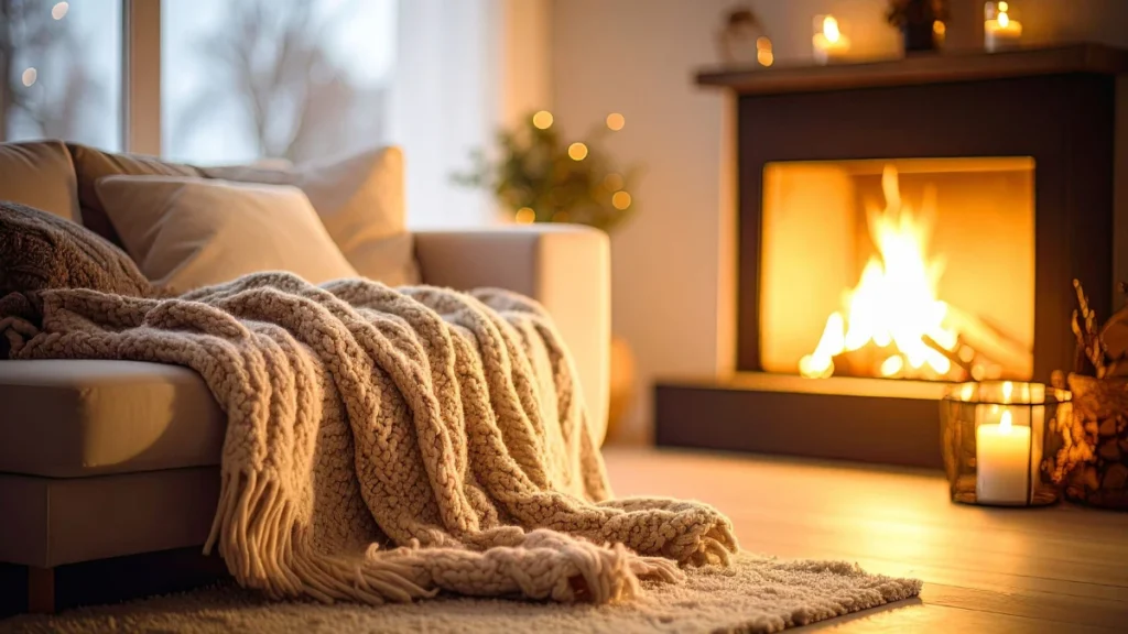
Bulb color completely changes how your room feels off or right. Cool white bulbs belong in hospitals and commercial kitchens. You want a warm and inviting glow in your home.
You must keep all bulbs at a warm white lighting temperature of 2700K. This specific temperature mimics the golden hour of natural sunlight. It makes paint colors look richer and fabrics look softer.
Smart Lighting Control
You need to control the intensity of your lights. Putting everything on dimmers changes the entire mood of a house. You can adjust the brightness based on the time of day.
If changing wall switches feels intimidating, use smart bulbs instead. Philips Hue smart bulbs cost about $45–$90 and plug into any standard lamp. With the lights dialed in, let us physically move your pieces.
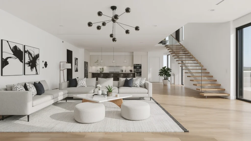
All Your Furniture Hugs The Walls
You want your room to feel as big as possible. Your first instinct is to push every piece of furniture flat against the walls. This creates a massive empty space in the very center of the room.
This instinct actually destroys the flow of your home. Pushing sofas against walls creates a massive dead zone in the center. You end up having to shout across a massive empty floor to speak to a guest.
The Fear Of Floating
People suffer from an irrational fear of floating furniture. They worry that exposing the back of a sofa will look messy. They worry about tripping over pieces placed in the middle of the room.
“Floating your furniture is the easiest way to make a small room feel massive. Pulling pieces away from the wall creates an illusion of infinite space behind them,” explains author and stylist Emily Henderson.
Creating Conversational Groupings
You need to pull your seating arrangement inward. Think about how people actually talk to each other. They lean in and make eye contact.
Bring your chairs and sofa closer together around the coffee table. Leaving just one foot of breathing room behind the sofa makes walls feel wider. The room suddenly breathes and feels intentional.
The Standard Clearances
Good design relies on invisible math. You must leave enough room for people to walk comfortably. If pieces sit too close together, the room feels like an obstacle course.
The National Association of Home Builders states specific traffic rules. Leaving a minimum of 18 inches between the coffee table and sofa is the industry standard for comfortable traffic flow. You need 36 inches for primary walkways.
Defining The Walkway
Pulling furniture away from the wall creates natural hallways. People can walk behind the sofa instead of cutting through the conversation area. This makes the room function much better.
Measure the distance between your coffee table and seating right now. If it measures less than 18 inches, push the table out. Now that your sofa sits proudly in the room, look at the blank wall behind it.
Your Art Is Hung Uncomfortably High
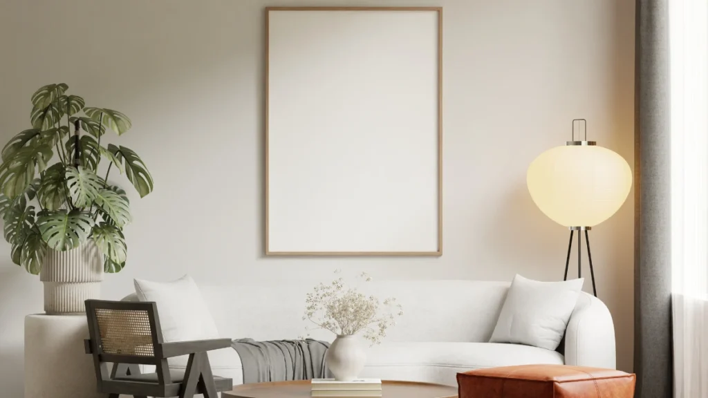
You buy a beautiful piece of framed art. You stand up straight, hold it against the wall, and hammer the nail. Most people hang art while standing up, which ruins the seated perspective.
Hanging art relative to the ceiling instead of human eye level ruins room proportions. It forces everyone to crane their necks upward. It leaves a massive awkward gap between the furniture and the frame.
The Museum Height Rule
There is an exact mathematical formula for hanging art. Galleries and museums all over the world use this exact same measurement. Gallery standard hanging height is precisely 57 inches on center.
This means the exact middle of your artwork must sit exactly 57 to 60 inches from the floor. This measurement represents the average human eye level. It ensures the art connects visually with the humans viewing it.
Spacing Above Sofas
Hanging art over furniture requires a different approach. You want the art to feel connected to the piece below it. If it floats too high, it looks completely lost on the wall.
Provide a strict 4 to 6 inch gap between the top of the sofa and the bottom of the frame. This tight spacing visually groups the sofa and the art together as one single unit.
Finding The Center Point
Finding the center point takes only two minutes. Measure the total height of your frame and divide that number in half. Add that half measurement to the 57 inch rule.
Measure up from the floor to that final number and make a pencil mark. This is exactly where your nail goes. Proper placement fixes the walls, but the room might still feel flat.
The Space Lacks Texture And Depth
You match everything perfectly. The sofa matches the chairs. The pillows match the curtains. The room looks incredibly clean, but it feels completely lifeless and boring.
A room where everything matches perfectly lacks soul. Flat fabrics absorb light and make spaces feel dull. You must add varied materials to make a room interesting.
Color Versus Texture
People often confuse color with texture. They think adding a bright red pillow fixes a boring room. Color changes the hue, but texture changes how light behaves in the room.
An all white room works perfectly if you mix materials properly. You must blend rough linen, heavy wool, smooth ceramic, and warm wood. The shadows created by these different surfaces provide visual interest.
Mixing Vintage With New
“A room should never look like it was bought entirely from one catalog. You must mix old textures with new ones to give the space a soul,” notes interior designer Nate Berkus.
You need items that show age and wear. A shiny new sofa looks much better next to an aged leather chair. The contrast between perfect and imperfect creates true designer magic.
The Material Mix Formula
Professionals use the 60 30 10 rule for mixing materials. Dedicate 60 percent of the room to a dominant texture like smooth cotton or linen. Use 30 percent for a secondary texture like warm wood or leather.
Reserve the final 10 percent for an accent texture like shiny brass or heavy velvet. This formula guarantees a balanced room every single time. According to Pinterest Trends, organic textures became the top requested design element in 2024 home remodels.
Instant Upgrades
You can add texture today without buying new furniture. Swap your flat cotton pillows for thick velvet or heavily woven alternatives. Beautiful West Elm velvet cushion covers cost just $35–$50 each.
Adding these layers brings warmth instantly. Reference the mood guide below to see how materials interact with room lighting. However, too many layers create a new problem entirely.
| Kelvin Rating | Best Room Application | Visual Effect |
| 2700K | Living Rooms | Warm, cozy, highlights textures |
| 3000K | Kitchens | Crisp, bright, good for tasks |
| 4000K | Garages | Clinical, harsh, stark contrast |
| 5000K | Commercial Spaces | Daylight simulation, very cold |
You Fell Into The Clutter Blindness Trap
You live in your house every single day. You stop seeing the mail stacked on the table. You ignore the random cords piled in the corner.
This phenomenon is called clutter blindness. You ignore everyday messes because you see them constantly. Your brain simply edits the mess out of your daily vision to save energy.
The Phone Photo Trick
You need to see your space objectively again. Stand in the doorway of your living room and take a photo with your phone. Look at the photo on your screen instead of looking at the room.
The camera does not lie or filter out messes. You will instantly spot the clutter you usually ignore. The photo highlights every awkward pile and messy horizontal surface.
Curated Collections Versus Pileups
There is a massive difference between styling and hoarding. A curated collection looks intentional and grouped. A pileup happens randomly when you just drop things on a table.
“Editing your accessories is the most powerful design tool you own. Remove everything from the table and only put back the items you truly love.”
Homes with heavily cluttered surfaces increase daily cortisol levels in residents by 15 percent, according to the UCLA Center on Everyday Lives of Families. Decluttering improves your mental health and your room design simultaneously.
The Rule Of Three
Styling horizontal surfaces requires restraint. Use the rule of three for coffee table styling. Group items in odd numbers because the human brain finds asymmetry more interesting.
Place a stack of books, a small plant, and a decorative bowl on the table. Leave the rest of the surface completely empty. Seeing your space through a new lens changes everything. Remind yourself that editing is just as crucial as adding.
Conclusion
Fixing interior design mistakes takes minutes once you know exactly what to look for. You just need to follow the invisible rules of scale and placement.
First, size up your rug so the front legs of your furniture sit firmly on it. Second, float your furniture away from the walls to create cozy conversation zones. Finally, bring your artwork down to the 57 inch eye level mark.
Grab a tape measure right now. Walk over and check the height of the art above your sofa. If the center sits higher than 60 inches, pull the nail out and move it down.

