You want to make room look expensive, but your living space currently feels cluttered and cheap. Horizontal surfaces are covered in daily junk.
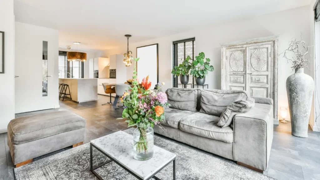
Your sofa is shoved against the wall like a doctor’s waiting area. This disjointed setup creates a constant background hum of visual stress. The secret to high end design is usually what you remove, not what you add.
You will learn the exact visual editing tricks professionals use to transform your space right now. Fixing this costs absolutely nothing.
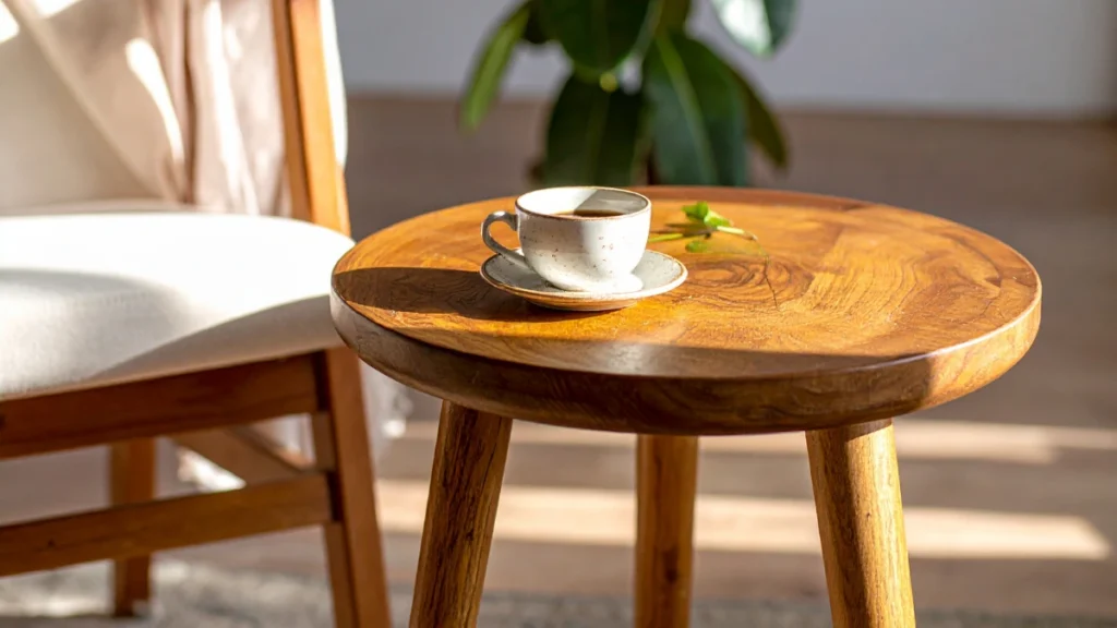
The Editors Eye for Coffee Tables
Horizontal surfaces are magnets for daily household junk. Mail, keys, and random cups gather on your coffee table by default. This creates immediate visual chaos.
Once your tables are clear, you need to look at where they sit. According to a UCLA design study, visual clutter increases cortisol levels by up to 20 percent.
This means your messy table literally causes you physical stress. You need an aggressive editing approach to fix this issue permanently.
Start by clearing everything off the table completely. Wipe the surface down so you have a fresh blank slate. Bring back items slowly and with deep intention.
Learning how to style a room starts with mastering visual weight. You want to group small objects into a single defined zone. Use a solid foundation like a heavy wooden tray.
Here is the exact method to restyle your coffee table for $0:
Surface Curation
Coffee Table Styling by Hazel Quinn | The Plan Decor
The Blank Slate
Clear every single item off the surface. Starting with a completely empty canvas is essential to visualize the spatial balance before introducing any new elements.
The Central Anchor
Place one large tray in the center to corral small objects. This establishes a designated focal point and prevents tiny decor pieces from looking like scattered clutter.
Varied Elevations
Stack two or three heavy art books to create varied height. Architectural levels guide the eye and add structural interest to an otherwise flat visual plane.
Organic Softening
Add one organic element like a simple plant or ceramic bowl. Introducing nature breaks up rigid geometric lines and breathes literal life into the arrangement.
Negative Space
Leave exactly fifty percent of the table surface completely bare. Embracing this breathing room is the ultimate secret to achieving a high-end, intentional aesthetic.
Negative space is just as important as the decor you choose. The empty areas allow your eyes to rest comfortably. A packed table looks like a cluttered thrift store display.
Designers know that leaving open space feels incredibly luxurious. Wealthy spaces never feel cramped or overstuffed with small items. You can mimic this exact feeling by removing half of your current decor right now.
You might own beautiful coasters or expensive candles. But displaying all of them at once dilutes their visual impact. Pick your favorite three items and store the rest away.
You will rotate these pieces seasonally to keep the space feeling fresh. This costs nothing and provides a constant sense of renewal. A clean table truly highlights the entire room.
Float Your Furniture Away From Walls
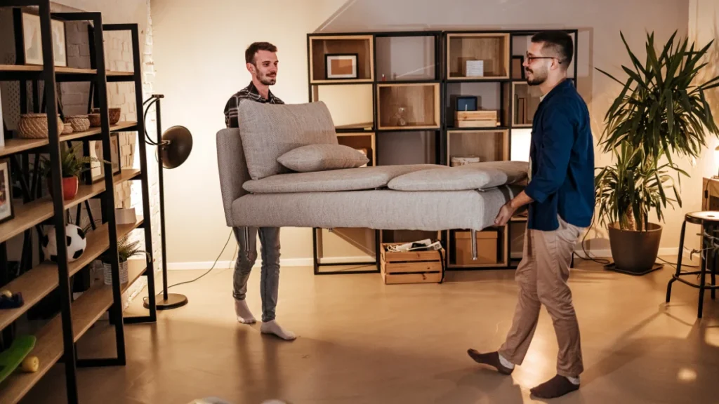
Look at your living room sofa right now. Is the back of it touching a solid wall? Over 70 percent of people default to pushing living room seating against the walls according to Houzz layout surveys.
This creates a massive empty dance floor in the middle of your room. It makes the space feel cold, disconnected, and surprisingly cheap. Furniture needs to relate to other furniture, not the architecture.
Pull your seating inward by just three inches. This creates a tiny shadow line behind the sofa frame. This dark line gives the illusion that the walls are further away than they actually are.
This is one of the best free home decor ideas you can implement immediately. Floating your furniture creates intimate and warm conversation zones. It forces people to face each other instead of staring at a blank void.
Designer Emily Henderson explains this perfectly. She states that floating furniture gives a room essential breathing space. Even a few inches of separation makes a room feel custom and deliberate.
You must anchor this floating layout with a properly sized rug. The front legs of every seating piece must touch the rug. This binds the separate items into one cohesive visual unit.
If your rug is too small, the floating furniture will look like a terrible mistake. A tiny rug makes the room look cheaper, regardless of how nice the furniture is. Aim for a standard large size to ground the space.
Space planning is about establishing clear boundaries for living. Try moving your chairs closer to the sofa today. Create a tight circle where you can easily pass a cup of coffee to a guest.
Moving furniture solves the floor plan instantly. You might think this will make a small room feel smaller, but the opposite is true. Pulling furniture to the center creates clear walkways around the perimeter.
These clear pathways make the room flow much better. Three inches of space behind the sofa makes the walls feel further away. Now that the layout is set, it is time to style your accents.
Master the Rule of Three to Make Room Look Expensive
Perfect symmetry often feels rigid and boring in a home. Human brains naturally look for patterns and matching pairs. When you present an odd number of items, the brain has to work slightly harder.
Asymmetrical groupings hold human visual attention 20 percent longer than symmetrical ones based on retail psychology data. This subtle lingering attention translates directly to a feeling of luxury. Grouping your decor in threes is a fundamental design trick.
You must vary the heights of these three objects. Pair a tall item, a medium item, and a short item together. This forces the eye to bounce up and down smoothly.
Texture is just as important as physical height. You should never group three shiny glass items together. Mix a glass vase with a rough wooden bowl and a matte metal object.
To help you build your own professional vignettes at home for $0, follow this simple styling formula. Use items you already own to create these specific combinations.
| Object Type | Height Requirement | Material Texture |
| Anchor Piece | Tallest over 12 inches | Smooth glass or ceramic |
| Grounding Piece | Short and wide | Rough wood or woven |
| Accent Piece | Medium height | Reflective metal or stone |
This structure guarantees your decor grouping feels balanced and intentional. If you have two identical candlesticks, separate them immediately. Put one in the living room and one in the bedroom.
Do not buy new items to fill these three slots. Shop your own house first to find hidden treasures. A beautiful book, an empty jar, and a smooth rock from the yard work perfectly.
This strategy helps make room look expensive without spending any money. It forces you to look at your possessions as distinct shapes and textures. Keep your objects visually balanced but never identical.
Now that your decor looks intentional, let the sun hit it.
Maximize Your Natural Light
Dark rooms always look cheaper than bright ones. Shadows hide architectural details and make spaces feel confined and small. Heavy window treatments scream outdated design and trap valuable sunlight.
Increasing natural daylight can make a room appear up to 15 percent larger visually. This is a massive spatial upgrade that costs absolutely nothing. You just need to uncover the light you already have available.
Start by physically cleaning your windows inside and out. Grime builds up slowly over months and filters out the brightest rays. Clean glass is the cheapest visual upgrade you can possibly make.
Remove heavy dark blinds or outdated plastic louvers. Pull your fabric curtains all the way open so they sit entirely on the drywall. Expose the full glass pane to the room to maximize brightness.
Here is a rapid process for maximizing your natural light right now:
Natural Light Amplification
Curated by Hazel Quinn | The Plan Decor
Interior Clarity
Wash the interior glass with a simple vinegar solution. This cuts through indoor dust and airborne grease, leaving an instantly streak-free, highly transparent surface.
Exterior Polish
Wipe down the exterior glass to remove hard water stains. Eliminating these built-up mineral deposits ensures maximum sunlight penetration from the outside in.
Unobstructed Flow
Push all curtain panels entirely off the glass surface. Mount your curtain rods wider than the frame so the fabric never blocks the edges of the incoming light.
Strategic Reflection
Place a large mirror directly opposite your brightest window. This architectural trick physically bounces the incoming light deep into the room, doubling your illumination.
That mirror trick bounces the incoming light deep into the room. It effectively creates a second window for $0. These simple bright room ideas instantly elevate the feeling of the space.
To ensure your window treatments are not blocking light, follow this reference guide for proper hanging measurements.
| Ceiling Height | Ideal Rod Placement | Minimum Drape Length |
| 8 feet | 2 inches below ceiling | 96 inches |
| 9 feet | 3 inches below ceiling | 108 inches |
| 10 feet | 4 inches below ceiling | 120 inches |
Hanging curtains high and wide makes ceilings feel incredibly tall. It frames the window beautifully instead of covering it up. Bright light also reveals your worst messes, so you must edit further.
Hide Your Wires to Make Room Look Expensive
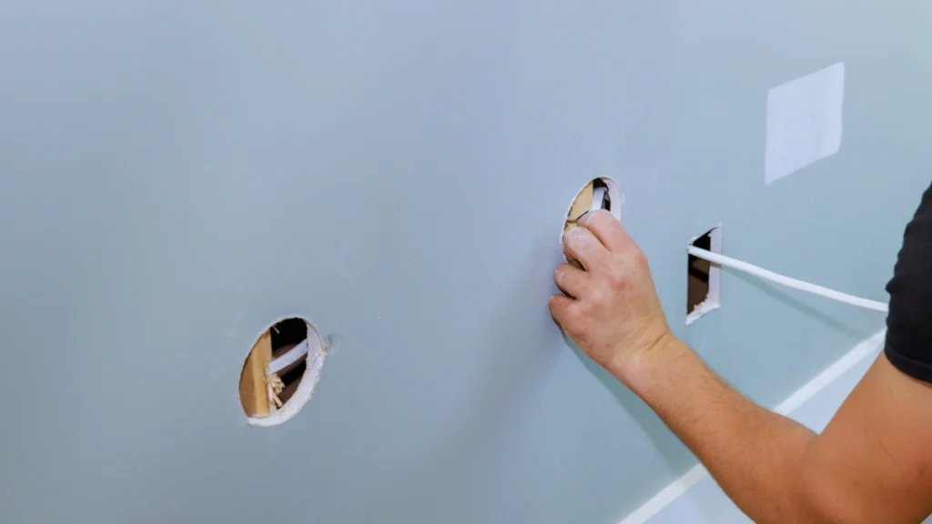
Look down at the black spaghetti pile under your television. Visible cords instantly cheapen a beautiful and tidy space. You can buy the nicest furniture in the world, but dangling cables ruin the illusion.
Exposed electronics wires are the top visual pet peeve for 60 percent of home buyers according to NAHB research. They signal chaos and unfinished work to anyone entering the room. Hiding them is the ultimate trick for luxury interior design on a budget.
Think about a high end hotel room for a moment. You never see the mechanics of the television or the bedside lamps. The cords are routed cleanly through the furniture or hidden behind walls.
You can replicate this clean look at home in ten minutes flat. Grab a handful of small plastic zip ties. Group all loose cables together tightly behind your television console.
Use simple Command wire hooks to run those bundled cords straight down the back of furniture legs. These handy hooks cost around $8 and adhere securely without damaging your paint. Tucking those away takes ten minutes but changes the whole room.
Once the wires are gone, tackle the small daily clutter on tables. Put television remotes, phone chargers, and game controllers inside closed woven baskets. If it does not look like deliberate art, it needs to be hidden.
You can further elevate your walls using cohesive gallery displays. Instead of scattered random photos, use identical frames. IKEA Ribba frames cost around $15 and make any art collection look like a curated gallery.
Place small functional items on dedicated surfaces to maintain order. A Target Threshold decorative tray on your console table gives keys and mail a specific home. This tray costs $25 but saves your room from total chaos.
Clean baseboards and hidden wires scream luxury and high end care. When the mechanics of your home are invisible, the architecture truly shines. Your space finally feels peaceful.
You do not need a massive budget to create a beautiful home. You just need to edit your surfaces aggressively, float your furniture correctly, and hide your ugly cords. These spatial strategies change how a room feels immediately.
Your home should be a place of rest, not a source of visual stress. Pick one room right now to test these ideas. Set a timer for 15 minutes and pull your sofa three inches off the wall.
Clear off your coffee table and group three textured items together. These tiny intentional actions stack up quickly to transform your home. You now have the exact skills to make room look expensive today.

