Cora wanted the perfect living room, but her space felt like a chaotic furniture showroom. She tried using the 60 30 10 color rule to fix her visually overwhelming and completely mismatched apartment.
She had spent months saving up for a gorgeous velvet sofa and expensive throw pillows. Yet nothing looked right together.
She needed a strict plan to fix her expensive design mistakes. This exact mathematical formula helped her create a perfectly balanced, designer room without paying a professional.
What Exactly Is The 60 30 10 Color Rule?
Cora started her research by defining the exact math behind the interior design formula. She learned that the 60 30 10 color rule dictates how much of each color belongs in a single space.
Sixty percent represents the dominant base color in the room. Thirty percent acts as the secondary support color for large furniture. The final ten percent serves as the bold accent color for small details.
This simple mathematical division gives the human eye a comfortable way to process visual information. Math and art overlap beautifully when designing a comfortable home.
Cora realized her brain craved this specific proportion without her even knowing it. Rooms without this balance feel automatically stressful and visually exhausting.
She read research from the Color Marketing Group during her early planning phase. Their data showed that 85 percent of consumers cite color as the primary reason for buying a product.
She realized she was buying products solely based on their individual colors. She was never considering how they fit together as a mathematical whole.
The formula works in every single room of a house because it forces strict color boundaries. It stops people from buying too many competing bright items.
Cora found an interview with interior designer Emily Henderson that changed her perspective. Henderson noted that every room needs a touch of black or a dark grounding color to feel complete.
Cora decided to apply these exact interior design color ratios to her own space immediately. Here is the exact breakdown she used to organize her items moving forward.
- 60 percent: Walls, ceiling, large area rugs, main flooring
- 30 percent: Sofas, accent chairs, window treatments, large bookshelves
- 10 percent: Throw pillows, lamps, artwork, small coffee table books
- Bonus 10 percent: Mixed metals, picture frames, hardware, natural wood tones
Her Chaotic Before Room Needs A Diet
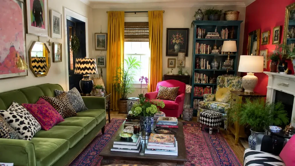
Standing in her living room, Cora realized her space was visually exhausting and completely disorganized. She had made the common mistake of splitting her favorite colors evenly across the entire room.
This equal division created intense visual tension everywhere she looked. Her emerald green sofa fought constantly with her bright blue geometric rug.
Neither piece could stand out because they were both demanding attention at the exact same time. Her living room color schemes were completely out of balance.
She also had bright yellow curtains that clashed horribly with her red throw pillows. Every single item in the room was shouting for attention simultaneously.
Cora reviewed a Houzz design trend report that made her feel much less alone in her frustration. The report noted that 45 percent of renovating homeowners struggle most with selecting a cohesive color palette.
Her room desperately needed a strict color diet right away. She decided to strip everything out of the space and start over entirely from scratch.
Removing the visual clutter allowed her to see the bare bones of the room for the first time. She sold the items that disrupted the new plan to buy better pieces.
Cora kept her favorite items but promised to be ruthless with new purchases. She knew she had to build a proper foundation first before adding any accessories.
She created a physical mood board to track every single item she planned to keep. This visual tool helped her see exactly where her previous design attempts had failed.
She was finally ready to start applying the math to her empty living room.
| Percentage | Living Room Items | Bedroom Items |
| 60 Percent | Walls, ceiling, large rug | Walls, bedding foundation, flooring |
| 30 Percent | Sofa, curtains, accent chairs | Headboard, window treatments, dresser |
| 10 Percent | Throw pillows, lamps, art | Throw blanket, nightstand decor, art |
Choosing The Dominant 60 Percent Foundation
Getting the biggest surface area right was the most crucial step for Cora. The dominant color sets the absolute mood and tone for the entire living space.
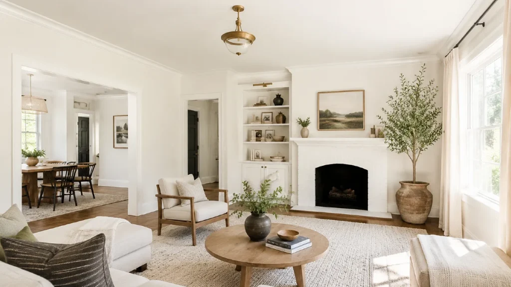
She learned that neutrals work best for this massive 60 percent layer. Whites, creams, and soft grays create a quiet backdrop for more expensive furniture pieces.
Painting The Main Walls
Using a bright color for the dominant layer often makes a room feel tiny and aggressive. Cora decided to paint her walls and ceiling to establish a calm, clean baseline.
She read a recent Zillow report about the specific financial value of neutral spaces. Zillow found that homes with light, neutral living spaces sell for a higher premium than those with dark walls.
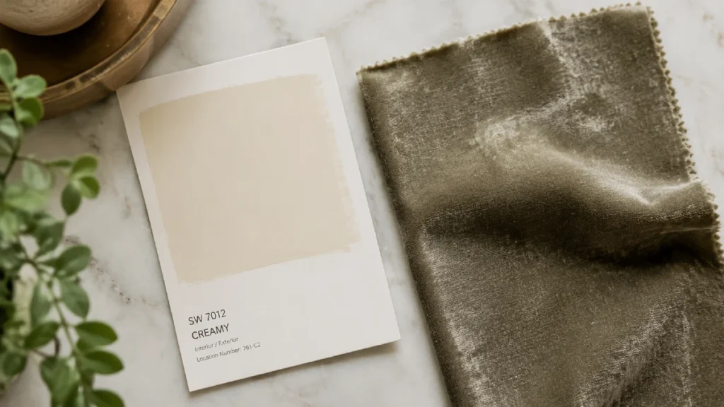
This data convinced her to play it safe with her largest permanent investment. She went to the hardware store and bought four gallons of Benjamin Moore White Dove paint for $280 total.
This warm white provided the perfect creamy base without feeling too sterile or cold. Painting the walls took her an entire weekend, but the effort completely transformed the apartment.
Grounding The Floor Space
Cora also needed to address her dark, scratched wood floors to hit her dominant percentage. She bought a large ivory wool rug for $450 to cover the heavy floor space.
The wall color and the rug together completed her dominant 60 percent layer perfectly. The room already felt twice as large and significantly more peaceful than before.
Her wall color clearly dictated the rest of her upcoming design choices. She was now ready to find the perfect sofa to anchor the space.
Adding Depth With The 30 Percent Secondary Layer
Cora called this secondary layer the actual personality of her living room. This 30 percent chunk supports the main foundation while adding necessary depth and interest.
Large, heavy furniture pieces belong entirely in this specific category. Cora needed a rich color that would contrast beautifully against her new warm white walls.
Selecting The Perfect Sofa
She wanted a color she genuinely loved but would not tire of quickly. She looked up data from Furniture Today to see what other people were buying for their homes.
The publication reported that neutral or solid color sofas make up over 60 percent of all upholstery sales. These solid pieces act as ideal anchor items for the 30 percent rule.
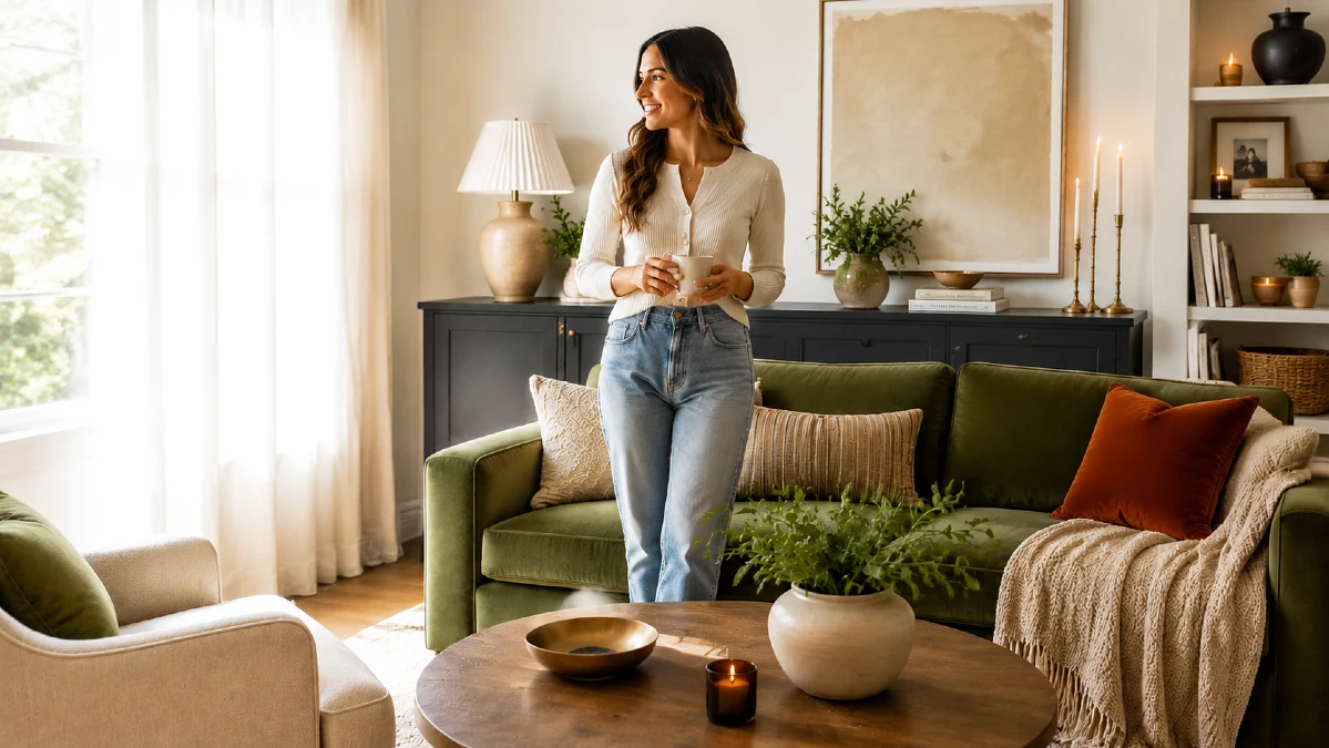
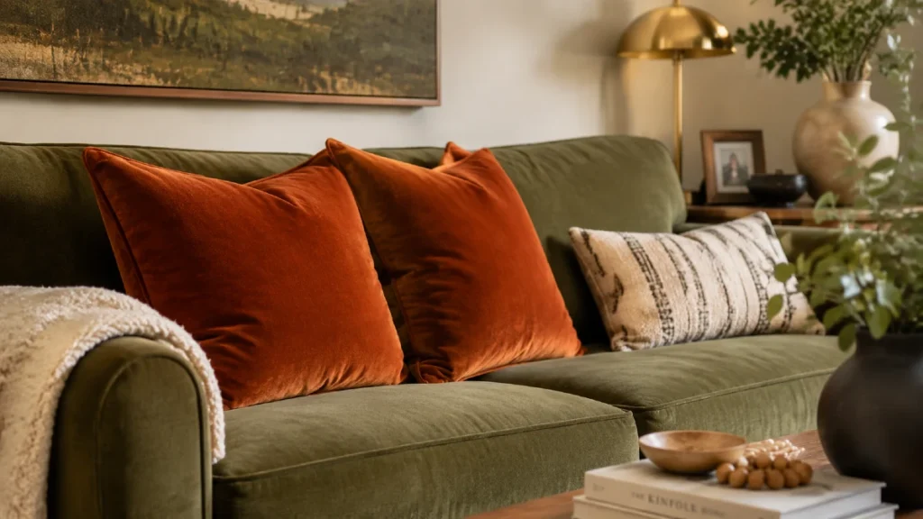
Cora invested in a West Elm Harmony Sofa in worn olive velvet for $1,899. This deep green piece became the absolute star of her newly painted white room.
She loved how the olive green felt earthy and grounding without being too dark.
Matching The Window Treatments
She added matching olive linen curtains for $120 to carry the color up the wall.
These careful choices clearly defined her secondary living room color schemes. She also painted her old wooden bookshelf a similar muted green to match the vibe.
Cora learned how to use the 60 30 10 rule by keeping this layer unified. She was careful to avoid matching her secondary pieces too closely to her dominant walls.
The room was finally starting to look like a professional interior designer had planned it. She just needed a few small pops of bright color to finish the job.
Designing The 10 Percent Accent Magic
Shopping for the final accent color was the most fun and affordable step of the entire process. The 10 percent layer is exactly where Cora could finally take bold design risks.
A bright accent color pulls the human eye all the way across the room. Small items like throw pillows, candles, coffee table books, and artwork fit perfectly here.
These decorative pieces are incredibly easy and cheap to swap out when seasonal design trends change. Cora found Pinterest search data showing a massive spike in colorful interior accents.
Searches for colorful living room accents increased by 40 percent as renters looked for temporary personality fixes. She read advice from interior designer Leanne Ford about creating visual warmth.
Ford emphasized the power of using warm white as a foundation so colorful accents can truly shine. Cora chose a burnt rust orange for her 10 percent accent color.
She bought two CB2 velvet throw pillows in rust for $80 to place on the green sofa. She also framed a $45 modern art print featuring the same deep orange tones.
She bought a rust colored ceramic vase for $25 to sit on her coffee table. Spreading these warm orange accents around the room made the entire design look highly intentional.
The rust color complemented the olive green sofa perfectly while standing out against the white walls. She successfully learned how to use the 60 30 10 rule without spending a fortune.
Her friends thought she hired an expensive decorator when they saw the finished results.
| Design Style | 60 Percent Dominant | 30 Percent Secondary | 10 Percent Accent |
| Modern Organic | Warm White | Olive Green | Matte Black |
| Coastal Calm | Crisp White | Sandy Beige | Navy Blue |
| Moody Maximalist | Charcoal Gray | Emerald Green | Mustard Yellow |
Breaking The Color Rules Safely
Design rules exist to give a strong foundation, but they are eventually meant to be broken. Cora realized she could bend the formula once she mastered the basic math.
She introduced herself to the 110 percent rule after living with her space for a month. This advanced technique simply involves adding a second 10 percent accent color to the room.
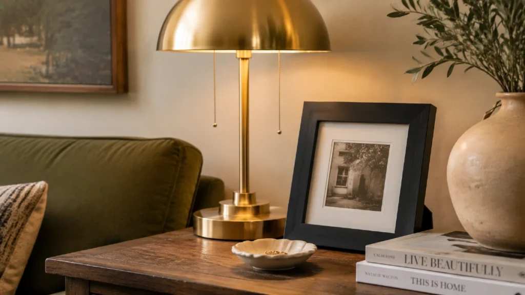
Cora also learned that mixing metal finishes counts heavily toward her accent details. HGTV design surveys indicate that mixing two distinct metal finishes is currently favored by top designers.
Perfectly matching hardware looks outdated compared to a mixed metal approach. Cora added a brass floor lamp for $150 next to her sofa.
She also installed matte black cabinet pulls for $35 on her media console. Mixing the warm brass and the harsh black added incredible depth to the living room.
She also started using different shades of her olive green secondary color throughout the space. Adding lighter and darker green tones created rich texture without breaking the core ratio.
Cora bought a pale sage green throw blanket for $40 to drape over a chair. These small tweaks proved that strict rules provide a very safe starting point.
However, her own personal style ultimately finished the room and made it feel like home. Cora trusted her own eye to make the final creative adjustments.
Cora finally achieved the perfect living room balance she had always wanted. The mathematical formula created instant harmony and completely eliminated her previous visual clutter.
Using neutral shades for her biggest elements protected her most expensive financial investments. Meanwhile, her cheap and colorful small accessories let her true personality shine through.
Her friends constantly ask how she afforded such an expensive looking interior makeover. She always tells them to pick one room in their house today.
She tells them to take a quick photo on their phone right now. Then they can easily identify their current color percentages. Anyone can fix a chaotic space by simply applying the 60 30 10 color rule.

