
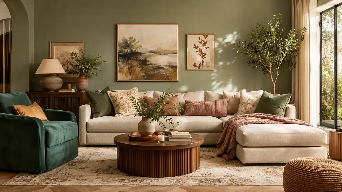
Choosing a living room color can feel harder than choosing the sofa. A shade that looks rich on a screen may turn flat, cold, or darker once it meets your walls and light.
That uncertainty leads to saved pins, half-finished sample patches, and rooms that stay beige because beige feels safe. Yet the wrong neutral can make furniture look dull and disconnected.
These 22 living room color ideas turn 2026’s strongest shades into livable palettes. You will find warm neutrals, smoky greens, deep browns, soft pastels, and bold accents, plus ways to balance color with wood, fabric, and light.
The Color Balance That Keeps a Room Polished
The Color Balance That Keeps a Room Polished
Give each shade a clear role, connect stronger colors with natural materials, and test the full palette in the room’s real light.
The four-part color formula
-
Control the Distribution
Give Every Color a Different Job
Let one shade cover most of the walls and large surfaces. Repeat a second color through the sofa, rug, or curtains, then reserve the boldest shade for small, intentional accents.
Dominant shade Supporting color Small accent dose -
Soften Strong Color
Bring in Warm Natural Materials
Pair earthy greens and warm browns with oak, walnut, linen, rattan, and woven texture. Natural finishes break up saturated color and make dramatic walls feel comfortable enough for everyday living.
Oak and walnut Linen Woven texture -
Choose the Right Contrast
Use Creamy White Instead of Stark White
Sharp white can look disconnected beside khaki, rust, clay, or chocolate. A creamier white creates a softer, warmer transition that keeps the entire palette visually connected.
Warm undertone Softer contrast Connected palette -
Test Before Committing
Check Paint in the Room’s Real Light
Place a large sample beside the flooring and your biggest furniture piece. View it during the morning, afternoon, and after lamps are switched on before painting every wall.
Compare with flooring Morning light Lamplight
1. Olive Green and Warm Cream Layers
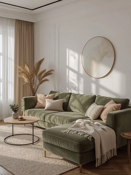
Decor formula: olive sectional + blush cushions + cream rug + warm wood table
A deep olive sectional anchors the room, while soft blush pillows, a fringed cream throw, and a textured neutral rug keep the darker color from feeling heavy. Taupe curtains, pale walls, and the slim round coffee table add warmth without competing with the sofa.
Natural sunlight brings out the green upholstery’s earthy undertone and creates a calm, polished look. The oversized circular wall piece balances the wide sectional, while dried palm stems add height beside the low furniture.
Color note: Repeat olive only once or twice through a small plant or ceramic accessory. Too many matching green accents would weaken the relaxed contrast that makes this living room color idea work.
2. Soft Greige Living Room Layers
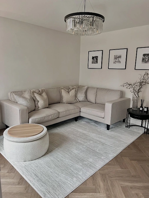
A pale greige sectional, silvered rug, boucle ottoman, and black side tables create a calm palette with crisp contrast.
Copy the look:
- Furniture: Choose a low sectional in warm stone or light taupe.
- Textiles: Mix velvet, woven, and softly fringed cushions in nearby neutral shades.
- Lighting: Add a glass chandelier with a dark frame to lift the simple color scheme.
- Finishing touch: Use slim black frames and tables to give the room a clear outline.
The large rug fits beneath the full seating area, making the corner sofa feel generous rather than bulky. Warm parquet flooring stops the gray tones from becoming cold, while the round ottoman softens the room’s many straight lines.
What to avoid: Bright white cushions could look harsh here. Cream, mushroom, and pale oatmeal will keep the palette connected.
3. Sage Green and Blush Velvet
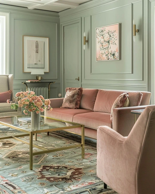
Why it feels chic:
- Soft sage walls wrap the room in calm color, while the panel molding gives the pale shade more depth and structure.
- Blush velvet seating adds warmth without overpowering the green. The dusty pink tone feels softer than bright rose and works well with traditional details.
- Brass sconces and the glass coffee table bring a polished glow, while their slim shapes keep the room light and open.
- The patterned rug blends sage, cream, brown, and faded pink, connecting every major color in one layered surface.
Proportion tip: The artwork sits neatly inside the wall panels, which makes the tall walls feel balanced. In a smaller room, use one larger print instead of several small pieces to avoid visual clutter.
4. White Sofa + Olive Pillows + Blush Accents
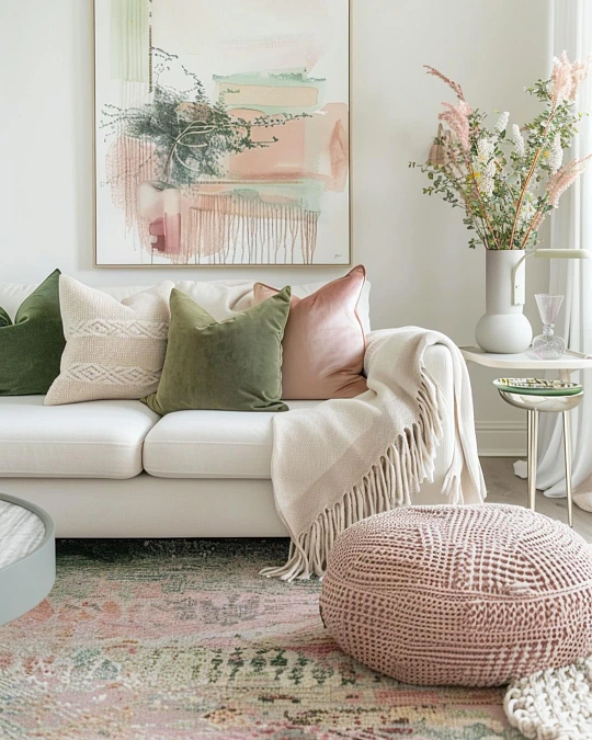
Best for: bright living rooms that need color without painted walls.
A clean white sofa creates a light base for olive velvet pillows, blush cushions, and a soft cream throw. The faded rug repeats those green and pink tones, while the knitted pouf adds a relaxed texture and a useful extra seat.
Oversized abstract art gives the compact sofa more visual presence. Fresh branches and feathery flowers add height beside the low furniture, helping the whole setup feel balanced rather than crowded.
Accessory idea: Keep the largest pieces neutral, then repeat two accent colors across pillows, artwork, flowers, and the rug. This simple living room color idea can be updated easily as seasons change.
5. Dusty Blue and Soft Gray Balance
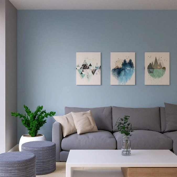
A muted blue feature wall gives this living room a calm focal point, while the soft gray sofa keeps the palette relaxed and easy to live with.
- Why it works: The wall color is slightly deeper than the sofa, so the seating stays visible without creating a sharp contrast.
- Styling tip: Cream cushions and a white coffee table brighten the cool tones, while green plants add a fresh natural accent.
- Use it for: Modern living rooms, apartments, or small spaces that need color without feeling busy.
The three evenly spaced prints suit the sofa’s width and keep the wall arrangement clean. Rounded gray stools soften the straight furniture lines and can double as extra seating or side tables.
6. Taupe Walls + Black and Brass Details
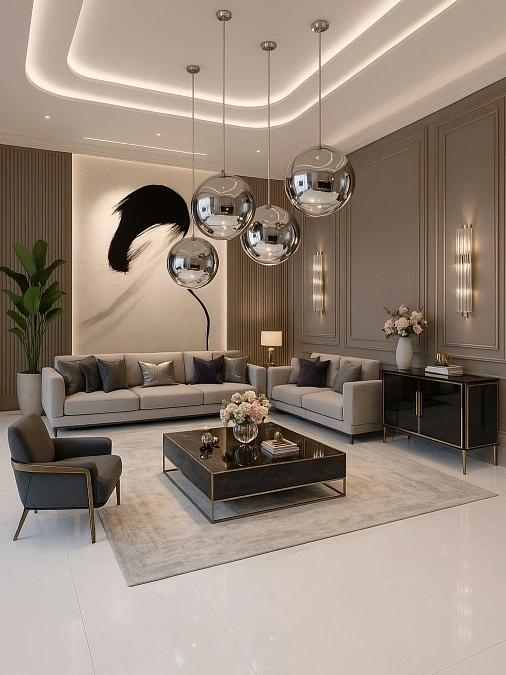
Decor formula: warm taupe paneling + cream sofas + black furniture + brushed brass accents
Tall paneled walls, oversized abstract art, and sculptural chrome pendants give this living room a strong sense of scale. Cream seating and a pale rug soften the darker console, coffee table, and charcoal chair, while brass edging adds warmth to the neutral living room color palette.
Layered ceiling lights and slim wall sconces prevent the taupe walls from looking flat. The large plant introduces a fresh green note, and the repeated black accents keep the open room polished and connected.
Lighting idea: Use several low, warm light sources instead of one bright ceiling fixture to make gray and taupe shades feel richer after dark.
7. Emerald Green and Warm Bronze
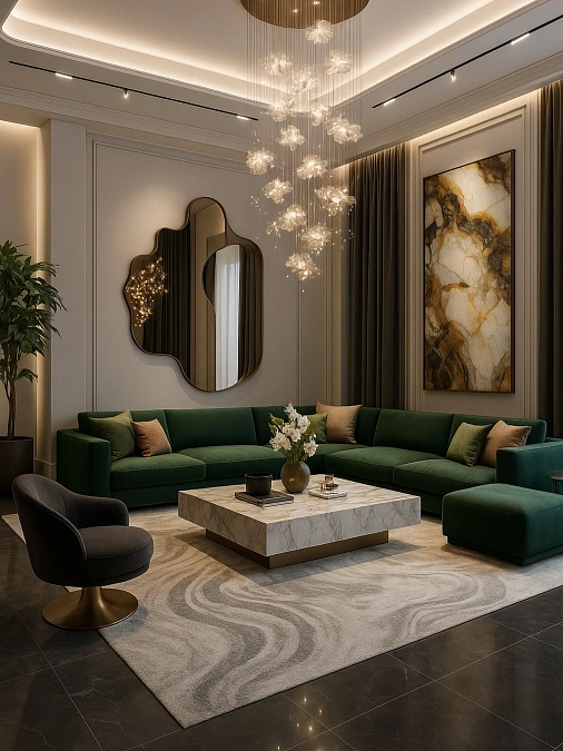
A deep emerald sectional gives this grand living room its strongest color moment, while taupe paneled walls and dark flooring create a rich, grounded backdrop. Camel pillows, bronze details, and the cream marble coffee table warm the green without dulling its depth.
Lighting idea: The cascading glass chandelier spreads light across the tall ceiling and keeps the darker palette from feeling closed in. Hidden ceiling lighting also defines the room’s architecture after sunset.
The sculptural mirror, stone-inspired artwork, and swirling neutral rug repeat soft organic shapes, balancing the sectional’s clean lines. This living room color idea works best in a spacious setting where the saturated green has enough room to breathe.
8. Burgundy Velvet and Warm Ivory
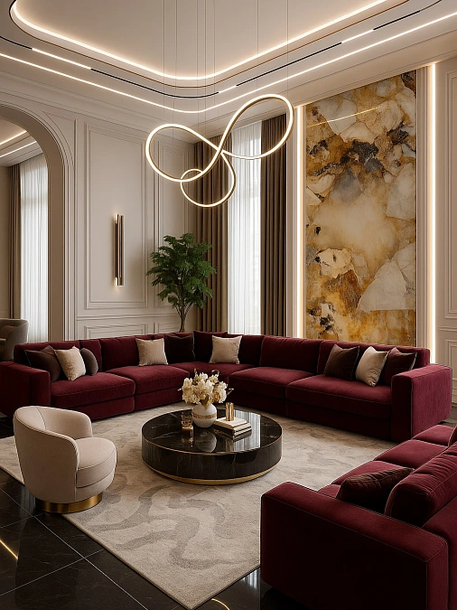
A sweeping burgundy sectional, cream accent chairs, and a glossy black coffee table create a dramatic palette with a polished, hotel-like mood. Warm ivory walls and a pale patterned rug keep the wine-red upholstery from overpowering the room.
Color note: The amber, cream, and charcoal wall art connects the sofa to the darker flooring and gold lighting. This makes the bold living room color idea feel planned rather than added as a single statement.
- Scale: The wide sectional suits the tall walls, while the round table and curved chairs soften its long, straight shape.
- Lighting: Sculptural loop lighting and concealed ceiling strips spread a warm glow across the velvet, brass, and stone finishes.
9. Olive Curves and Cream Bouclé
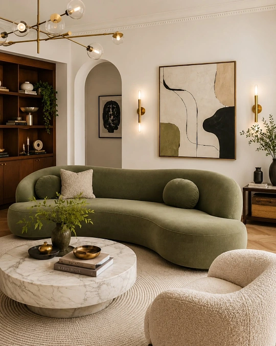
Decor formula: olive curved sofa + cream bouclé chair + marble table + walnut shelving
A sculptural olive sofa brings earthy color and soft movement to the room, while the rounded bouclé chair and circular marble coffee table repeat its flowing shape.
Cream walls, a woven neutral rug, and warm walnut storage keep the green grounded and prevent the palette from feeling too cool.
Brass sconces and the branching chandelier add a gentle glow, while the abstract artwork repeats olive, black, and beige for a pulled-together finish. The mix of velvet, bouclé, wood, stone, and greenery creates depth without relying on extra clutter.
10. Olive Velvet and Raw Concrete
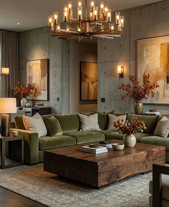
An olive velvet sectional, exposed concrete walls, and a solid walnut coffee table create a rich mix of soft and rugged materials. The green upholstery warms the cool gray backdrop, while cream pillows keep the seating from looking too dark.
Seasonal swap: Rust-colored branches and amber artwork make the palette feel especially inviting for fall. Replace them with fresh greenery and pale ceramics in spring for a lighter mood.
The oversized chandelier suits the broad sectional and substantial table, giving each piece enough visual weight. Warm lamps and wall sconces soften the concrete after dark, while the textured gray rug connects the hard flooring, natural wood, and plush fabric.
11. Cream Bouclé and Light Oak
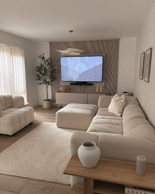
A channel-tufted cream sofa, rounded bouclé chair, oversized ottoman, pale rug, and light oak flooring create a soft monochrome living room with plenty of texture.
The vertical wood-slat media wall adds warmth and definition, keeping the television area from disappearing into the neutral walls.
Small-space note: Low furniture and a wall-mounted television preserve clear sightlines, which helps the room feel wider and less crowded.
The sculptural pendant introduces gentle movement above the straight media unit, while the tall potted tree brings natural color without disturbing the calm palette.
Keep decorative objects matte and minimal here, since glossy finishes or strong accent colors could weaken the relaxed, cohesive effect.
12. Warm Taupe and Botanical Greens
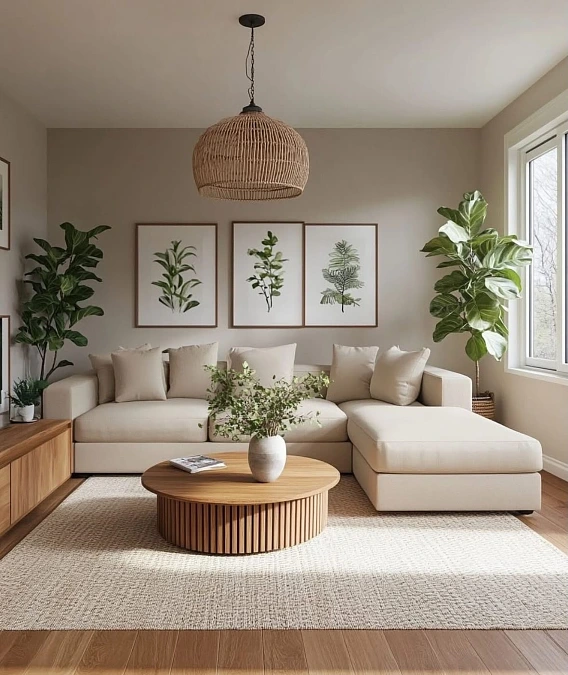
A cream chaise sectional, warm taupe walls, leafy botanical prints, tall indoor trees, and honey-toned wood create a fresh neutral room with a natural edge. The woven pendant, textured rug, slatted coffee table, and simple greenery add depth while keeping the palette calm and uncluttered.
Strong daylight brightens the creamy upholstery, while the darker green leaves frame the sofa and balance its wide shape. Three matching prints fill the wall neatly without competing with the plants.
Copy this: Start with beige and cream, add medium-toned wood, then use real or faux greenery as the main accent color.
13. Mustard Yellow and Charcoal Gray
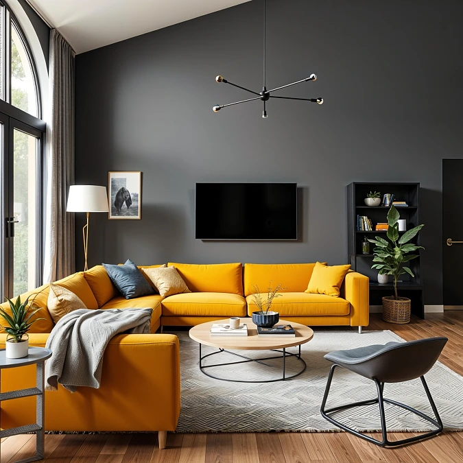
A mustard yellow sectional fills the room with energy, while the charcoal feature wall gives the bright upholstery a strong, modern backdrop.
Why it feels bold:
- The warm sofa stands out clearly against the cool gray wall without making the room feel chaotic.
- Blue-gray cushions and the slim accent chair soften the yellow with a quieter secondary shade.
- A pale geometric rug and light wood coffee table brighten the center of the room.
- Black shelving, window frames, and lighting repeat the wall color for a clean, connected finish.
Color note: This palette works best with plenty of daylight. In a darker room, choose ochre instead of vivid yellow to keep the contrast warm and comfortable.
14. Mustard Walls + Gray Sofa + Black Accents
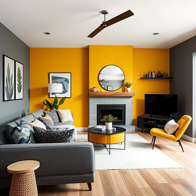
Mustard yellow walls turn the fireplace into a bold focal point, while charcoal side walls and a medium-gray sofa ground the brighter color. Black furniture, frames, and lighting sharpen the palette, and pale wood flooring keeps the room warm.
Color balance: Repeating yellow on the accent chair and coffee table makes the wall color feel intentional. White rugs, cushions, and fireplace tile add enough breathing room between the saturated shades.
- Scale: The round mirror fits the narrow chimney breast and softens the room’s many straight lines.
- Budget swap: Paint one architectural feature mustard, then repeat it through one chair or a few small accessories.
15. Warm Mocha and Cream Neutrals
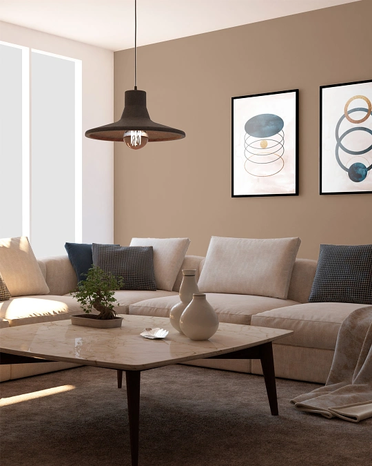
Warm mocha walls, a cream sectional, charcoal pillows, and a pale stone coffee table create a soft neutral palette with clear contrast. The brown wall adds depth behind the light sofa, while black frames and the oversized pendant give the room a sharper modern outline.
Touches of muted blue in the artwork and cushions cool the warmer shades without making the space feel cold. Natural light keeps the mocha paint airy, and the dark rug grounds the large coffee table and low seating.
Proportion tip: Hang artwork close enough to the sofa that both pieces read as one arrangement. Wider prints or a third frame would better fill a longer wall.
16. Sage Green Paneling and Soft Cream
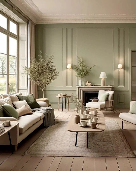
Sage green paneled walls, creamy upholstered seating, olive cushions, pale wood tables, and a softly patterned beige rug create a calm palette with classic structure.
The muted green highlights the molding without making the tall room feel dark, while white trim and generous window light keep every surface fresh.
Natural branches, linen curtains, ceramic vessels, and slender black table legs add texture without crowding the elegant layout. The long coffee table suits the wide seating arrangement, and its rounded corners soften the room’s formal architecture.
Practical takeaway: Use sage across every wall when the room receives strong daylight. In a dimmer space, keep the green on one paneled feature wall and paint the remaining walls warm cream.
17. Deep Teal and Warm Caramel
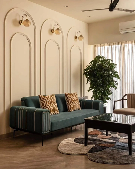
A deep teal sofa, caramel patterned cushions, cream arched molding, and amber glass sconces create a rich palette with a warm modern feel. The dark green upholstery gives the compact seating area weight, while the pale walls and sheer curtains keep it bright.
Color note: Caramel works well here because it warms the cool teal and connects it to the brown flooring, coffee table, and curved rug pattern.
- Why it works: Repeated arches add height and make the plain wall feel architectural without extra artwork.
- Easy upgrade: Replace the dark coffee table with medium oak if the room needs a lighter, more relaxed finish.
18. Espresso Walls and Soft Ivory
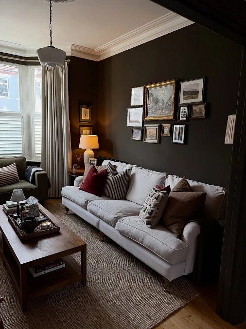
Copy the look:
- Furniture: Choose an ivory sofa with traditional curves and one olive accent chair.
- Textiles: Layer burgundy, chocolate, cream, and striped cushions for warm contrast.
- Lighting: Use a ceramic table lamp and pale curtains to soften the dark walls.
- Finishing touch: Build a mixed-frame gallery wall with vintage-style landscapes and sketches.
Deep espresso paint makes the pale sofa stand out, while walnut furniture and a natural woven rug keep the room warm and grounded. The gallery wall suits the intimate scale and gives the dark backdrop a collected feel.
Cozy upgrade: Add one aged brass object or a small amber glass vase to repeat the warmth already found in the frames and lamp light.
19. Camel Sofa + Teal Chair + Greenery
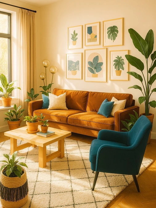
Decor formula: camel velvet sofa + teal armchair + botanical prints + light wood table
Warm camel upholstery gives the room a sunny base, while the deep teal chair and matching cushions add cool contrast. Cream walls, curtains, and the grid-pattern rug keep the stronger colors bright rather than heavy.
Terracotta pots and leafy plants repeat the greens shown in the gallery wall, helping the room feel layered and connected. The large plant beside the sofa balances the tall window, while smaller pots bring color closer to the coffee table.
Color note: Keep the wood pale or honey-toned so the orange, teal, and green palette stays fresh instead of overly dark.
20. Mint Green and Powder Pink
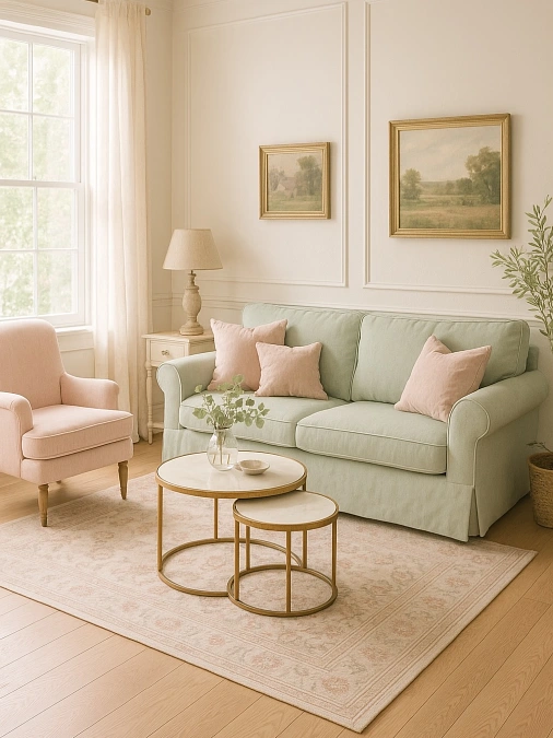
A pale mint sofa, powder-pink armchair, blush cushions, creamy paneled walls, soft landscape art, and slim brass nesting tables create a gentle pastel palette that still feels grown-up.
Warm wood flooring and antique-style gold frames stop the cool green upholstery from looking icy, while the faded pink rug quietly repeats the chair and pillows.
Natural light filters through sheer curtains, keeping every shade soft and airy. The small nesting tables suit the compact seating area and leave more floor visible than one heavy coffee table would.
Make it cozier: Add one oatmeal throw or a small woven basket to bring a natural texture into the polished pastel scheme.
21. Teal Sofa and Mustard Accents
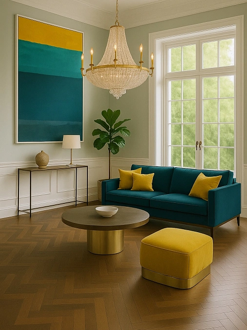
Decor formula: teal sofa + mustard cushions + sage walls + brushed brass furniture
A saturated teal sofa brings depth to the pale sage room, while mustard pillows and a matching ottoman add a bright, warm contrast. The oversized color-block artwork repeats both accent shades, making the bold palette feel balanced and intentional.
The crystal chandelier, brass coffee table, and warm herringbone floor give the stronger colors a polished finish.
Scale note: The tall artwork and large pendant suit the high window and prevent the compact sofa from looking lost against the expansive walls.
22. Warm Mushroom and Cocoa Layers
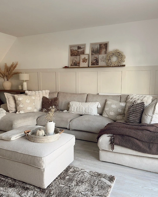
Best for: relaxed fall styling with a soft, neutral base.
A mushroom-gray sectional, cream ottoman, cocoa throw, and pumpkin-patterned cushions create a cozy palette without using bright seasonal orange. Beige wall paneling adds quiet structure, while the narrow picture ledge displays muted landscapes, leaf prints, and a textured wreath.
Chunky knits, ribbed pillows, pampas grass, and the shaggy rug layer several soft materials, helping the pale room feel warm rather than flat. The oversized ottoman also suits the deep sectional and keeps the seating area comfortable for everyday lounging.
Seasonal swap: Replace the pumpkin cushions and dark throw with sage linen and light oatmeal textures after fall.